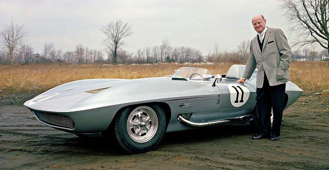
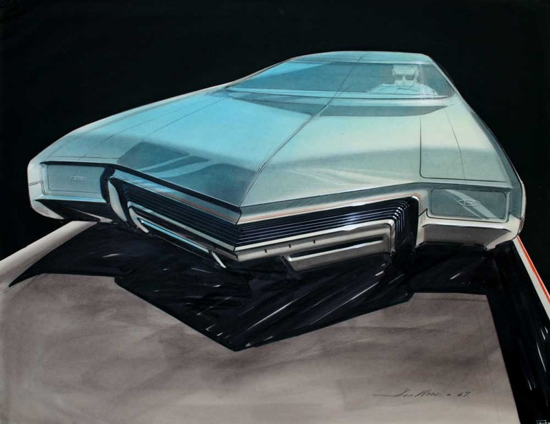
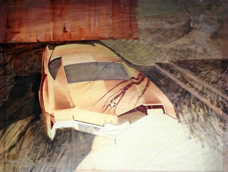
Bill Porter is not as famous as his flamboyant predecessor as head of GM Styling, Bill Mitchell. Porter had worked his way up from a summer intern fresh out of Pratt, all the way through being Chief designer for Pontiac before he replaced the mercurial Mitchell at the helm. While the 1960s was a golden age at GM that saw many prodigious talents flower, I have to say that for me, Porter's work stands out as some of the finest examples of the art of sketching from that era. As a trained designer myself, I stand in awe at his sensitivity to light and shadow and his masterful use of shading and line weight to convey fluidity and reflectivity of the surfaces he is drawing.
The sketch below is one of his Pontiac sketches. What I love is how the important parts such as the chrome grill are rendered to an almost real level, but the outer parts of the drawing are so quick and sparse, giving just enough information for the eye to comprehend the shapes. Compared to some of the spectacular final airbrush renderings of the period, some of you may not find this impressive. But all Porter used here was pencil, pastel (or maybe conte crayon?), and black marker, and he probably did this pretty fast. At his peak as a designer, he would have done a whole pile of drawings like this in a single day, showing different front-end themes. Very impressive and worthy of close study in today's age of digital tablet sketches, where variations can just be done as layers over a 3D under-drawing. Today's tools are still no substitute for sheer talent, but most practicing designers you talk to will agree, those guys were just on another plane...
 Click HERE to see more amazing GM Styling sketches from the 1960s over at Dean's Garage.
 Monday, May 13, 2013 at 9:27AM
 Design History,
  GM Styling,
  golden rocket,
  oldsmobile,
  show car in
  History