Entries in advertising (10)

Wednesday
Jul252012

Lancia Voyager: "Emotions to Share" ?

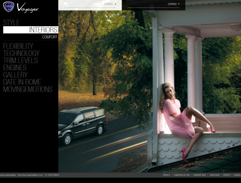
Lancia just unveiled their new website full of thinly disguised Chryslers.  The tagline for the new Lancia Voyager minivan (nee Plymouth) is "Emotions to Share."  Well, I've got some fucking emotions to share, Lancia! Like Disgust. Outrage. Betrayal.  The Lancia brand has been in decline for many years under inept Italian leadership.  But this infusion of oversized, underwhelming American product to prop up the nameplate is just beyond pathetic.  Lancia fittingly chose a woman perched on a roof gazing mournfully downwards as she contemplates whether to jump to her death or go downstairs and drive that trashwagon parked outside. I found that imagery quite resonant to my own emotions as I looked through the site.

This guy looks dumbfounded. Can you blame him??Seeing the legendary name Flavia applied to a Chrysler 200 (nee Sebring) convertible makes me want to puke almost as badly as I wanted to puke when I was forced to drive one of those pieces of junk as a rental last year. Going through this new website, it astonishes me how much care and thought was put into the marketing of such utterly shit cars.  The vast amounts of money that was spent on photoshoots, branding consultants, web development, etc. All of this trouble to sell cars that should never have existed. The workings of the modern corporation never cease to confound me.After roughly a century of innovation, style, motorsports success, and the rest, this is what Lancia is reduced to: a noble badge on a worthless car.  To again quote the Lancia marketing:
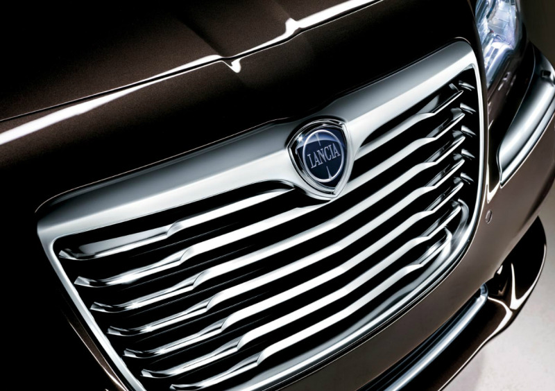
"There are certain emotions which go straight to the heart. Even if they have to cross an ocean."

How true.  Lancia, you are dead to me now.

Sunday
Nov062011

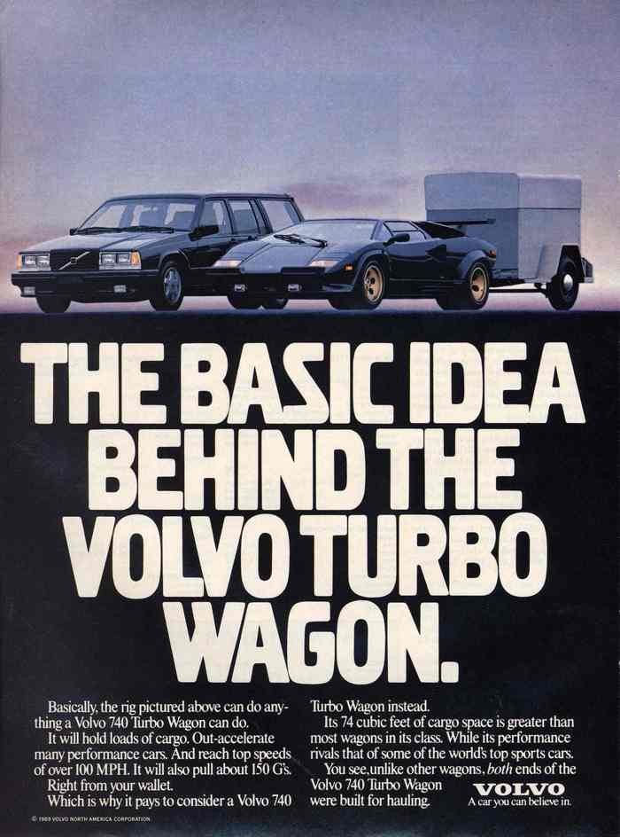
Volvo 740 Turbo Wagon: It Hauls

I miss the old days when Volvos were proudly unsexy.

Monday
Nov222010

FIAT - Floundering Italian Advertising Talent?

I just caught an eyeful of the supposed "first new FIAT commercial" aimed at the US Market, via jalopnik. And folks, I almost lost that Tiramisu I had for dessert.  Porca Miseria!

FIAT has two monumental challenges in re-entering the American market. Not only must it overcome the fears of notorious Italian unreliability and indifferent service it engendered in older consumers 30 years ago, but it must essentially launch a NEW BRAND for the majority of their target entry-level buyer segment, who are too young and too car-ignorant to have ever known what a FIAT was in the first place. And if this ad is any indication of what they are bringing to the table, Sergio Marchionne may as well stay soakin' in that hottub with Berlusconi until they cook up something sexier.

If have rarely seen such bland, meaningless stock imagery combined with such artless cinematography of the actual car. The first shot where we actually see the product (after 35 nauseating seconds!), the car drives over a distracting manhole cover in the road. Couldn't they have chosen a different snippet of footage to start off with?? Combine this with the computer generated "flower-petal" imagery (at 0:41 and 0:52) which is blatantly yanked from the original VW beetle and iMac campaigns from c.1999, and seems utterly out of place in this commercial. 

The messaging touts the car as an expression of the "Italian Way" yet we never are shown the original car or how pervasive and loved it is throughout Italy. No, instead we are subjected to cloying imagery of an archetypal Italian Grandma kissing a child, and fields of olive trees. The only reference to FIAT's history is the parade of badges towards the end, which will bewilder most Americans (who, as I said, have no real idea what a FIAT is) and only emphasizes the fickle nature of the company's branding over the years.

In the end, I am left trying to take stock of what I am supposed to come away with.  Where is the "Zoom Zoom" or the "Let's Motor"?  "Life is Best when Driven" probably sounded cool in Italian (I have a strong suspicion this ad was done by an Italian agency because the cheese factor reeks distinctively of Parmeggiano) but in English it just sits there in all its inglorious passive voice.

I could rant like this for hours, but I think i'll shut up and let you watch it already!

La Dolce Vita, it ain't!

And the music was awful too, wasn't it? But at least they didn't use Opera...

Wednesday
Nov172010

Truth in Advertising: the 2011 Mediocrity

Last month, Subaru unveiled a series of hilarious videos poking fun at mainstream family sedans. If you haven't seen them yet, you have to at least watch this one, which features earnest, hardworking designers articulating their vanilla-tinted vision of motoring ordinariness. The ads are funny, but they do sort of dance around the hard question of why it is that mediocrity is so pervasive in corporate design culture --even at Subaru. Sorry guys but the B9 ("benign" like a tumor that won't kill you?) Tribeca is nothing but warmed over Alfa 147 design cues stretched to grotesque proportions.

In reality, designers usually don't sit down and figure out how to make an intentionally bland car, but somehow at the end of the process a bland car is what results. If only it were a question of just setting out with the right goals from the start, but in truth mediocrity is a result of an insidious and self-destructive corporate culture that warps otherwise talented individuals into collectively ruining the fruits of their own labor -- a non-process that twists good notions into bad results.  What I love about this campaign is to see the truth of it all so perfectly labelled: Mediocrity is the only way to describe it.

Saturday
Feb202010

"Joy is BMW" - Advertising Review

"The Ultimate Driving Machine" has been synonymous with BMW for decades, but BMW's latest ad campaign de-emphasizes that well-loved slogan for the moment (they claim they are not abandoning it entirely) in favor of "Joy is BMW."

Naturally, the Bavarian automaker has gotten a huge amount of flak for this move from various people whose opinions I respect a lot.  In particular, Peter DeLorenzo (aka the autoextremist) devoted his column this week to lambasting BMW for their boneheadedness.  While many of Peter's points are on the money - namely the fact that they have over-broadened their product offerings to include bloated SUVs, the inexplicable and unforgivable X6 and other non sport-sedans, I thoroughly disagree with his assessment of the commercial itself.  De Lorenzo claims that the ad is bland, and could have been made by any car company - even KIA.  Makes me wonder if I saw the same ad that he did. I don't think KIA can show legions of fans polishing vintage examples of its cars, or classic roadsters like the 507 and Z8 in  its ads.  In the new Joy commercial, BMW's history, design culture, and performance capability are all well captured in a package that I could relate to as a car nut, but also which I think other people could find eye-opening.  The ad showcases some of BMW's most forward thinking designs (such as the Gina concept) while touting their genuine following among enthusiasts with footage of BMW car club events.

  In contrast to what the autoextremist says, I think that this is a refreshing step away from the overserious, monochromatic luxury sport sedan commercials -Stock white yuppie with sunglasses driving on deserted road- that BMW has been doing for years and years. The core of most German luxury sedan advertising has been about Engineering, Quality, and driving Performance enabled by advanced technology.  In this respect BMW's message has been lost in the swirl of identical claims by Audi, Mercedes, and of course Lexus and the rest of the Asian luxury companies. This standard format has gotten tired, and I believe most people have learned to tune it out by now.  Just as Cadillac radically altered their image a few years back in order to forge a more relevant brand identity, I don't think BMW is amiss in taking a different tack here.  I don't think they should abandon "the Ultimate Driving Machine" (which is originally a line from a Pontiac GTO ad, mind you) but grow upon that and make the brand come alive more by appealing to the emotion as much as the logic of the target customer.  So in my opinion this ad is successful in being disruptive, and making the viewer pay attention to the message that BMW is sending through Patrick Stewart's silky voiceover: Our cars are exhilarating to drive, technologically advanced, heirs to a noble legacy, and people of all stripes love owning them.  Perhaps the mood of the commercial is overly jubilant, but so what? I like it. It's bright, optimistic and inclusive.  I think it would have been just as effective though, had they kept the "Ultimate Driving Machine" tagline in the voiceover at the end.
What do you think? Watch the commercial below, and contrast with the previous style of BMW ad beneath.

Page 1 2