Have 2010's F1 Cars been beaten with an Ugly Stick?
 Wednesday, February 17, 2010 at 9:27PM
I think I might be starting to show my age because as the F1 season is getting ramped up for 2010, all I can think of is how little interest I have in it, and how ugly and weird looking F1 cars have gotten. F1 has gone through "ugly periods" before. The cars of the mid seventies were particularly odd and ungainly. Mechanically they were quite similar to those of the late 1960s, but with the radiators moved out to the sides, large wings and mammoth slicks applied, topped off with ridiculous high-hat airboxes attached to the still-exposed engines. I enjoy these cars enormously, but beautiful they are not. It wasn't until the ground effects cars came into vogue and the increased use of full-coverage fiberglass bodyshells came about that F1 cars became more flowing and graceful again. The Lotus 79 is perhaps the epitome of this more graceful style of late 70s car. By the time the Brabham BT50 came around in 1982, F1 cars had a new purity. This was helped even more by the dawning of the turbo era, which eliminated the bulky airboxes of the 70s.
The introduction of the carbon fiber monocoque as the 80s progressed allowed a new level of refinement and aerodynamic wizardry to improve the breed once more. By the late 80s and early 90s (let's just call it the Senna era) some of the best looking F1 cars of the modern era were being designed and raced. Turbos were out, and airboxes were back, but this time with graceful sweeping lines, sculpted directly into the engine cover. In my opinion, the most elegant F1 car of the modern era was the Jordan 191, with which Michael Schumacher had his debut F1 race at Spa in 1991. This car epitomized the super-sleek, clean look of the time. It is not a coincidence that the one F1 car in the MoMA collection is a 1990 Ferrari 641. The car is just pure and purposeful from every angle.
Some might mark the beginning of the end as 1990, when Tyrrell debuted the first "high nose" on its F1 car. Benetton became more associated with this design feature, which it appropriated and continuously refined from 1991 onward until all the rest of the teams eventually adopted it by 1996. The last car in F1 to have a "low nose" was the 1995 Ferari 412T2. It was quite a stunning car - probably the last F1 car that can honestly be called "beautiful"- and it was fittingly raced in the last year before an ascendant Michael Schumacher came over to Ferrari and changed the sport forever. Although the "low nose" was now consigned to the history books, I think F1 cars for the most part continued to be very sleek, clean and purposeful even with the high noses, but not for long.
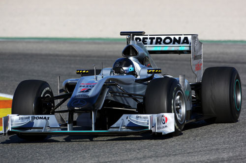
To me, the biggest nail in the coffin was when the FIA decided that F1 cars should be longer, and that the wheels should no longer sit outside the front wing. When you look at an early 90s F1 car, the big slicks frame a delicate, pencil point nose and front suspension. Now, the front tires are hidden behind a massive "front loader blade" wing which of late has become covered in various aerodynamic appendages - some of which resembling a concorde jet wearing a false moustache - that do the car no aesthetic favors. The rear wings on these cars are even worse. Not only are they enormous, they have a separate section of airfoils that "leans" forward over the rear deck of the car, completely spoiling the proportions of the vehicle from the side view. And now the engine covers, once sloping fluidly downwards behind the driver's head, now terminate in a vertical fin that continues all the way back to the aforementioned wing. The noses of the cars, once tapering pleasantly, now have all the appeal of a melted sex toy - especially this year's Mercedes (seen above). Side pods are concealed behind all manner of bizarre baffles and fins, it's a wonder the driver can see to his side. But then again who needs to see to his side if there is no overtaking anyway? In short, the new cars look like puke. Only puke covered in loud, tacky graphics. I am not that old yet, but I can already catch myself saying...Boy back when I was a kid, we had REAL racecars. Like I said. I think I might be starting to show my age...
See the full gallery of the cars mentioned above here.


Reader Comments